
Why Wedding Planning Often Feels Like Chaos (and How We Change It)
Wedding planning doesn't have to be stressful. Learn how to stay organized, keep the joy alive, and actually enjoy the j...
Discover the perfect typography for invitations, Save-the-Dates, and more! Tips and cool font ideas await you.
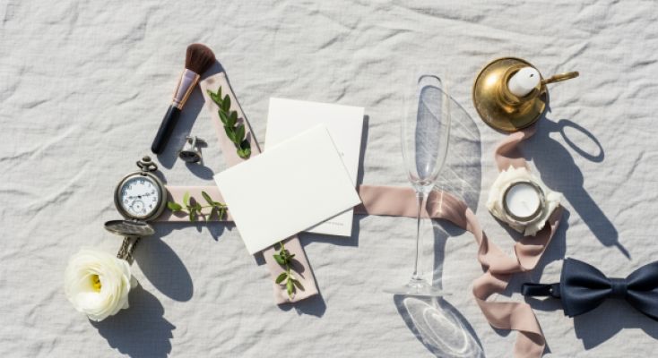
The typography is the voice of your wedding on paper. It determines whether your invitation feels elegant, playful, or urban. Even before anyone reads the text, the typeface communicates the mood. That's exactly why a deliberate choice is worth it—for invitations, save-the-dates, menus, and your website.
Classic, calm, high-end. Ideal for formal ceremonies in a castle, palace, or historic villa. Examples: Cormorant, Canela, Garamond variants.
Modern, clear, confident. Suits city weddings, industrial venues, and minimalist concepts. Examples: Neue Haas Grotesk, Söhne, Inter.
Handwritten, intimate, romantic. Perfect for names or short accents. Pay attention to good legibility and high-quality cuts that aren't overly ornate.
Characterful and attention-grabbing. Use sparingly, for a monogram or headline. Always consider print size and contrast.
Short answer: Build a palette of two to three fonts. A serif or sans for the body text, a more distinctive one for headings, and optionally an elegant script for names. That keeps everything consistent while staying lively. A single font can work if you play with sizes, tracking, and weights. For the entire suite (invitation, details, menu, seating plan, website): repeat your palette so there's a consistent thread.
Tip: Check that umlauts and the ß are well drawn. Many international typefaces support German, but not every one performs well in kerning.
Beauty only works if it can be read. Choose sufficient font size and line spacing. Use script fonts only for a few words. Check numbers and special characters in advance.
Use what's allowed. Desktop for layout, webfont for RSVP, possibly also app or e-reader if you plan a digital guestbook. Clarify the number of installations for the team.
Uncoated paper softens fine lines, metallic foil makes contrasts stronger. For letterpress, clear shapes and not-too-thin hairlines are suitable. A press proof before the big print run is worthwhile.
For German-language invitations you need reliable umlauts, small caps and nice quotation marks. Pay attention to OpenType features like numeral styles for dates and times.
Your typography is not a detail. It's the stage for your story. With a small, well-thought-out palette, clear hierarchy and awareness of print and licenses, paper becomes a feeling—from the save-the-date to the last menu card. If you're unsure, start with a serif plus a sans and add a script only if it truly has something to say.
wedset.app helps you plan your dream wedding. From the guest list to the timeline - we have everything under control.
Discover more helpful tips and ideas for your wedding
Wedding planning doesn't have to be stressful. Learn how to stay organized, keep the joy alive, and actually enjoy the j...
How to build your day-of timeline: times, buffers, examples – with tips for classic, relaxed, minimalist. Start of the A...
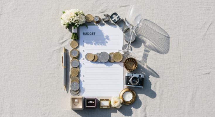
Wedding budget planning: Set priorities, avoid hidden costs, and save smartly – with a 10% contingency plan!